Blood Sword Cover Design
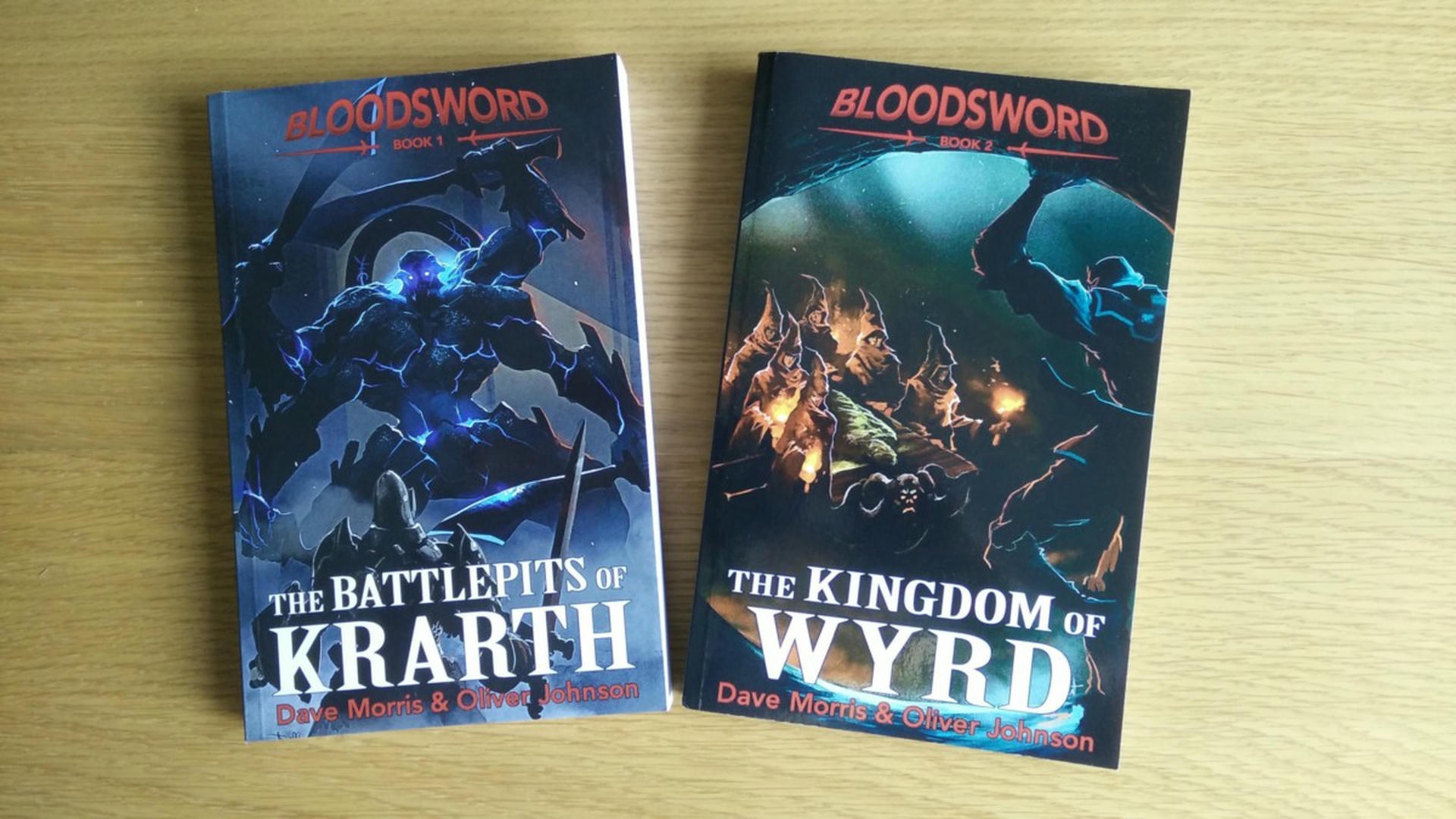
Recently I had the pleasure of working with Dave Morris, renowned game designer, author and veritable gamebook king. Dave is republishing his classic “Blood Sword” series and I offered a little design help with the logo and typography of the new covers.
Dave had new art provided by the French artist, Sébastien Brunet, noted for a variety of art styles but especially the work he’s done with Megara on Way of The Tiger. I caught a glimpse of some work-in-progress typography that Dave posted on Twitter and felt that it didn’t quite sell the Blood Sword brand, so I offered a little help. I produced a number of design treatments. Some hearkened back to old school gamebook typography, while others were designed to look more contemporary.
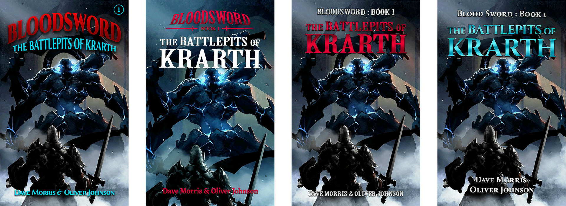
I’m pleased to say that after a bit of back and forth, we came up with a treatment that worked for all five books. This was harder than it sounds, due to an issue with inconsistent book titles: most were in the format “The [something] of [something]”, but book number four has a single word title, “Doomwalk”. This caused many more problems than you might imagine! Authors: Consider the consistency of your titles if you’re writing a series!
Dave has also written about the new covers on his own blog, but I thought I’d add my own note about it here. It was fun to work on something other than web design for a change (my day job) and I look forward to seeing how the final covers turn out in the republished editions.